Cielo Assurance
Making protection feel like something worth trusting.
Client
Cielo Assurance Group
Duration
3 Months
Services
Brand Identity · Web Design · Visual Communication

What makes RISA different?
Members of the project

Insurance is one of the hardest things to communicate well. The product is invisible, the value is hypothetical, and most firms in the space lean into fear to do the selling. Bold claims. Legal language. Stock photos of smiling families.
Cielo came to us knowing that wasn't the brand they wanted to build.
The name said everything about the direction — Cielo, Spanish for sky. Open, expansive, optimistic. A brand that wanted to feel less like a policy and more like a promise. Our job was to make that feeling legible across every touchpoint.
.png)
The Outcome
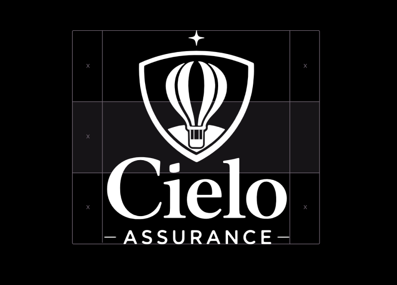
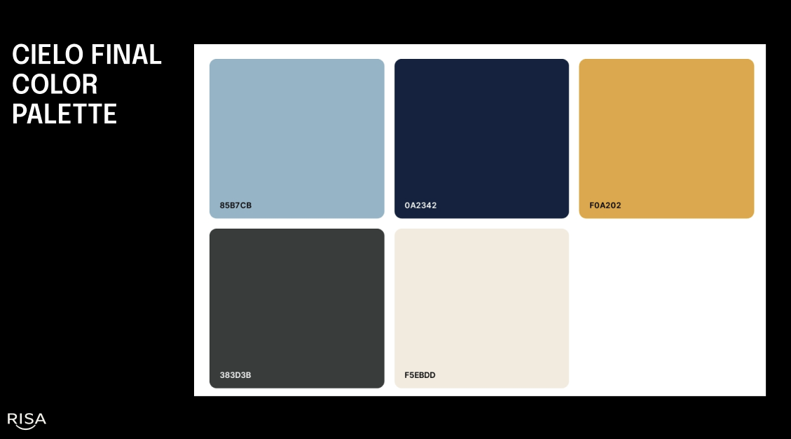
We started with the identity. The palette was built to distinguish Cielo from every other insurance brand in their space — warm, considered, confident without being aggressive. Typography that felt approachable but never casual. A mark that could hold its own on a business card and a billboard.
The website followed the same logic. Clear hierarchy, plain language, and a visual system that made a complex product feel simple to understand and easy to trust. Every page had one job — move the visitor one step closer to believing that Cielo was different because it actually is.
What the project proved is that the category a business operates in doesn't determine how its brand has to feel. Even in a space built on fine print and risk, there is room for warmth, clarity, and a visual identity that makes someone feel something before they read a single word.
Deliverables
Brand strategy · Logo system · Color palette · Typography · Website design · Visual identity guidelines